>>5524 >Edit 2 is probably the most dramatically improved. It's not perfect but the shading makes it look all the more detailed. >This my fav. This one doesn't look bad other than it looks like the colors have lost their vibrancy from being taken with a phone camera or something. I like the subtle glow. these two edits are pretty likely to be compiled for the compilation on the next thread. About Pharynx´s one, I know that it´s imperfect and maybe there some slight room for improvement but the colors of his body manage to be more precise and loyal to the show. The original idea was to edit it like I did for >>5222 though. These images all share the traditional art tag, so they aren´t fully defined or might have some flaw because of its format.
As you can see in Luna´s case >>5519, you can perfectly say that this image doesn´t have any mistake in its contours but the grayish tone prevents it from looking appealing to the eye. The edit could have helped that image for getting a few votes more on Derpibooru. In fact, anyone could upload the edit over there, because it has the artist needed tag (even though I wasn´t looking for that requirement necessarily).
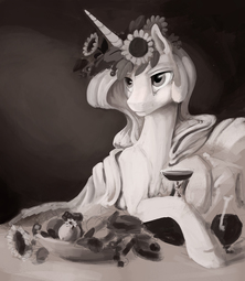
>I wonder if it's the chosen medium or just bad photos? I can´t answer that with certainty. The main idea was how much one can optimize images that fulfill the drawing aspect but fail to shine to the fullest. The chances to catch the attention from any viewer fall because of those details. And it seems that the main pattern for these bunch of pictures for these three are the lack of glow or the grayish tone.
I don´t know where the root of that problem comes from exactly but while editing them, one forgets how it occurred and instead focuses more on how to solve it.